Services · UI/UX and product design

Designed so the first guess is the right one.

Codeeo designs websites and digital products for UK organisations whose users scan rather than read. We research how people actually behave, build prototypes, test them with real users and hand your developers a design system they can work from, with accessibility treated as a design decision from the start.
Built for
UK products, services and websites that must be understood quickly by people who will not read instructions, including users with access needs.
Typical timeline
Three to six weeks for research, flows and tested prototypes before a build starts.
What you own
The Figma files, the research findings and the design system, handed over organised for developers.
Rated
4.7 / 5 from 23 Google reviews

In short

UK buyers of design work tend to ask two questions early: how will this be tested, and will it be accessible? The second matters more than many teams expect. The Equality Act expects organisations to make reasonable adjustments for disabled people, public sector bodies have their own accessibility regulations, and WCAG 2.2 has become the reference most procurement teams quote. We treat contrast, focus order, target sizes and plain language as part of the design rather than a final audit, and we suggest confirming any specific legal duty with your own adviser.

Research here also comes with data protection duties. Recruiting participants, recording sessions and storing notes all involve personal data under UK GDPR, so we agree consent wording up front, keep recordings only as long as they are needed and share findings without identifying anyone.

Language matters in a quieter way. British spelling, date formats, postcode address lookups and the way people expect to enter a phone number all affect whether a form feels trustworthy. Cookie consent under PECR is a design problem too: a banner that blocks the page or hides the reject option frustrates users and invites complaints, so we design it with the same care as the rest of the interface.

We work with UK clients remotely by video call. Research sessions can run online with participants from your own customer base, Figma files are shared live so your team can comment as the work develops, and every decision is recorded with the evidence behind it. Nobody has to travel, and stakeholders in different offices can join the same session.


200+ companies servedFrom a first store to an ADX listed developer

Modon
Majid Al Futtaim
HP
Belkin
Dulsco Group
OneClickDrive
Hanayen
HMS
Clocksprings
Ghezlan

What you get

Design that is tested, not admired.

Each deliverable exists to make something easier to use: research that shows how people behave, flows that match it, interfaces built on an accessible design system, and usability testing that proves it works. Visual polish follows from that work rather than leading it.
Explain your project
  • UX researchers

    Interviews and task analysis with real users, before anyone draws a screen.

    You build the product people asked for, not the one the room assumed they wanted.

  • UI designers

    Interfaces built from a system of parts, consistent across every screen and state.

    Every screen looks like it belongs to the same product, and new ones are quick to add.

  • Product designers

    The whole product thought through: onboarding, empty states, errors and what happens at scale.

    The edge cases are designed before build, so engineers are not inventing screens mid-sprint.

  • Design systems

    Tokens, components and documentation that keep ten screens or a thousand consistent.

    Design and development time drops because the parts already exist, and nothing drifts.

  • Wireframing

    Structure and flow agreed in grey boxes, where changes cost minutes.

    Structural changes cost minutes in grey boxes rather than sprints in code.

  • Prototyping

    Clickable prototypes on real devices, so testing happens before building.

    You leave with a clickable prototype tested on real users before committing engineering time.

  • Usability testing

    Five people who have never seen it, watched doing the three tasks that matter.

    You see where people get stuck while it is still cheap to fix.

  • Accessibility audits

    WCAG review and fixes, because an interface that excludes people is a broken one.

    You pass procurement and legal review, and the product works for everyone who uses it.

  • Figma design

    Files organised for developers: components, variants, specs and a handover that holds.

    Developers build from specs, not screenshots, and ask fewer questions.

  • Interaction design

    Motion and feedback that tell people what just happened without a tooltip.

    People know what just happened without a tooltip, so support tickets fall.

Who this is for

Three points where design pays for itself.

Design earns its place when it settles an argument with evidence. These are three situations UK teams bring to us, and what we test in each so the decision rests on user behaviour rather than opinion.
01

An accessibility review has flagged problems across the product

We map each issue to the component that causes it, fix the pattern in the design system so the fix spreads everywhere, and test with assistive technology. Your developers get annotated designs rather than a long spreadsheet of failures.

Fixed at component level so it stays fixed.

02

Users abandon a form or application halfway through

We watch people complete it, find the step where they hesitate, and rework the questions, order and error messages. Typical culprits are address entry, unclear eligibility and asking for information before explaining why it is needed.

Tested with people who have never seen the form.

03

Your website, app and marketing no longer look like one organisation

A shared design system brings type, colour, components and tone back into line, documented so in house teams and agencies apply it the same way. It also makes accessibility consistent, because each component is checked once and reused.

One system, checked once, reused everywhere.

Four phases, with real users in two of them.

  1. 01DiscoverWho uses it, for what, and where they struggle today. Interviews, analytics and support logs, turned into the three tasks the design has to make easy.
  2. 02DesignFlows and wireframes first, visual design second, always on the real content. Prototypes go in front of users and the parts they stumble on are redesigned.
  3. 03BuildHand-off is a conversation, not a file drop. We sit with the engineers through the build, and review what ships against the prototype that tested well.
  4. 04MeasureTask completion and drop-off after launch, compared to the baseline from discovery. The design is finished when the numbers say it is.

Selected work

Where this service has already shipped.

Two or three of the companies this lane has built for. The full list is on the work page.

01

Entertainment

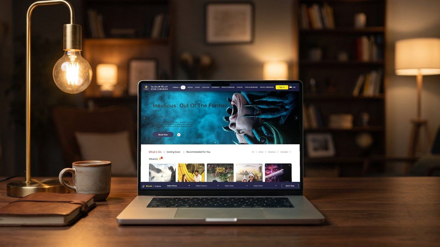
STAR CINEMAS

Ticketing across 100+ screens, rebuilt so seat selection works on a phone in under a minute.

The old flow asked for a cinema, a film, a date and a time before it would show a single seat, which is three screens of commitment before any value. We rebuilt it around the seat map, with showtimes as a filter rather than a gate, and made the whole path work one handed on a phone in a dark foyer.

View case
02

Education

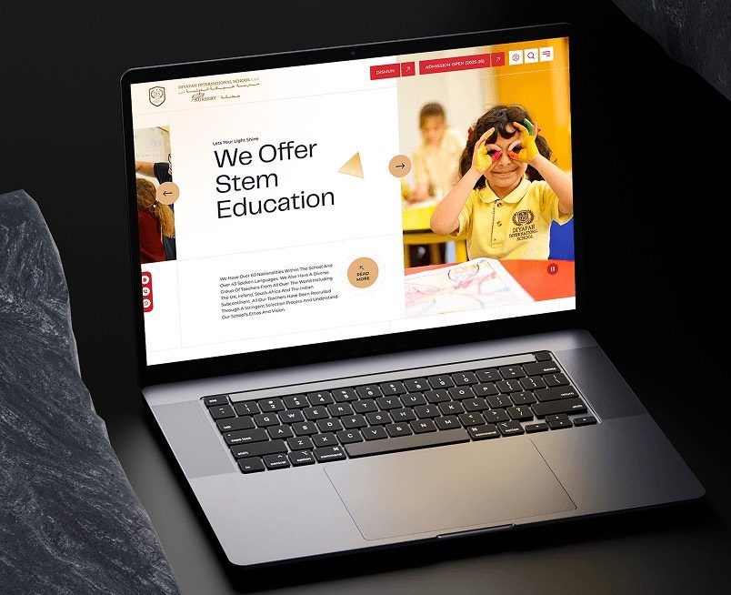
DIYAFAH

A bilingual school website built so the Arabic edition is the equal of the English one.

Most bilingual builds treat Arabic as a translation layer bolted on at the end, which shows up as broken layouts and stranded English. This was built right to left from the first commit, with its own typography and its own content, so an Arabic visitor gets the designed experience rather than a mirrored one.

View case

Technology

What we build this with.

Chosen to fit the problem and the team who will own it afterwards.

01Web

  • React
  • Next.js
  • TypeScript
  • Node.js
  • Laravel
  • WordPress

02Mobile

  • Swift
  • Kotlin
  • Flutter
  • React Native

Questions people ask before a design engagement.

Yes, accessibility is part of every design decision we make.

Contrast, focus states, target sizes, readable type, clear error messages and a logical heading structure are set in the design system, then checked in prototypes and again in the build. If your organisation has specific legal or procurement requirements, we recommend confirming them with your adviser and we design to that brief.

Tell us what the business needs. We will tell you what to build first.

Schedule a free consultation and get a written recommendation, with costs, before you commit to anything.

Get in touch

PROVEN RESULTS

4.7 / 5from 23 Google reviews